Analyzing the Data
Each new attribute can provide another avenue of analysis. Initially I only have 5 attributes to work with: ID, date/time, location, description, and district. My Data Studio schema includes those fields, as well as a count of results.
Data Studio makes it easy for me to start digging into the data. I started by creating two new calculated fields: Hour and Day of Week. I can use those to visualize activity…

The calculated fields help me tell a story by deriving attributes on-the-fly. Within Data Studio I was able to do this by first duplicating the date attribute and then changing the format to hour. I then repeated that but used day of week as the format.

Now I’d like to enrich the data by grouping the descriptions into categories. Before I can effectively do that though, I need to remove the trailing spaces that are padding the value.
I’ll rename the field in the CSV so that it starts with an underscore (a future reminder to not use that field)…

And then create a new field that trims the one from the CSV…

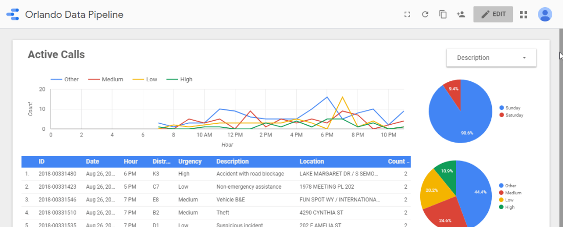
Now I can create an Urgency dimension by using a case statement in a calculated field…

This new calculated field let’s me convey more information to my users…
Although the calculated field is easy to craft, it’s difficult to maintain. I’d like to maintain the urgency dimension within it’s own CSV file. That way I can eventually merge it into the data pipeline itself, or at least more centrally maintain it.
Blending another Dataset
Over in my storage bucket I’ve created a new “dimensions” folder. Within it I’ve placed a CSV file named “urgency.csv”.

This file contains two fields: description and urgency.

With this done I can flip back over to Data Studio. First I’ll remove the Urgency field I just defined. If I keep it around I’ll get confused.

Next I’ll add a new Data Source named “Urgency” using the Cloud Storage connector. Unlike the previous post, here I’ll point to the specific file…

When I generated this CSV from the original source I didn’t trim the values. So I’ll rename the field in this dataset to match the other. Otherwise the blended values won’t match (because one will have trailing spaces and the other will not).

After adding the Urgency data source to the report, I’ll click Manage blended data from the Resources menu…

And then click Add a Data View…

Now I’ll pick each of the data sets with _Description as the join keys. All of the other fields will be included in the Additional Dimensions and Metrics sections. Once configured I clicked Save.

After clicking Save and then Close, I see that the existing visuals are broken. They’re broken because I removed the Urgency field from the original dataset. To fix it though I’ll need to actually switch the current data source to the new blended data set.

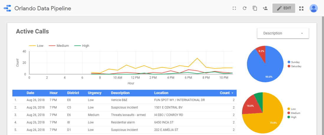
Here’s what it looks like once fixed…
The pipeline is coming along nicely! In the next post I’ll revisit some of the initial pipeline design choices and implement more features.
